

Tables: When and How to Use Them
Back in the early days of the web, before CSS existed to handle layout properly, developers used <table> tags to build entire page layouts, headers, sidebars, footers, all crammed into table cells just to get things to line up. It worked, technically, and it left tables with a bad reputation that's stuck around long after the reason for it disappeared.
That history is worth knowing, because it caused a real overcorrection. Plenty of developers today avoid tables entirely, even for the one job they're genuinely great at: showing real, tabular data.
The Backlash That Went Too Far
CSS arrived specifically to separate layout and style from structure, exactly the separation of concerns covered back in the very first article of this part. Once CSS could actually handle layout properly, using tables for that job became unnecessary, and eventually became seen as a bad practice, a relic of the old "div soup" problem, just with tables instead of divs.
But somewhere along the way, that lesson got overgeneralized into "never use tables," which throws out something genuinely useful along with the bad habit it replaced. Tables were never the problem. Using them for something they weren't meant for was.
When a Table Is Actually the Right Choice
Here's a simple test worth applying: does your content genuinely have two dimensions of meaning, real rows and real columns, where a specific value only makes sense in relation to both? A pricing comparison, where each row is a plan and each column is a feature, passes this test easily. A sports league's standings, a class schedule, a spreadsheet of financial data, all genuinely tabular, all excellent candidates for a real <table>.
A page layout, three columns of unrelated content sitting side by side, does not pass this test. There's no real relationship between "row 2" and "row 3" the way there is in a pricing table. That's a layout problem, and it belongs to CSS, specifically Flexbox and Grid, covered properly in the next part of this wiki.
The Core Structure
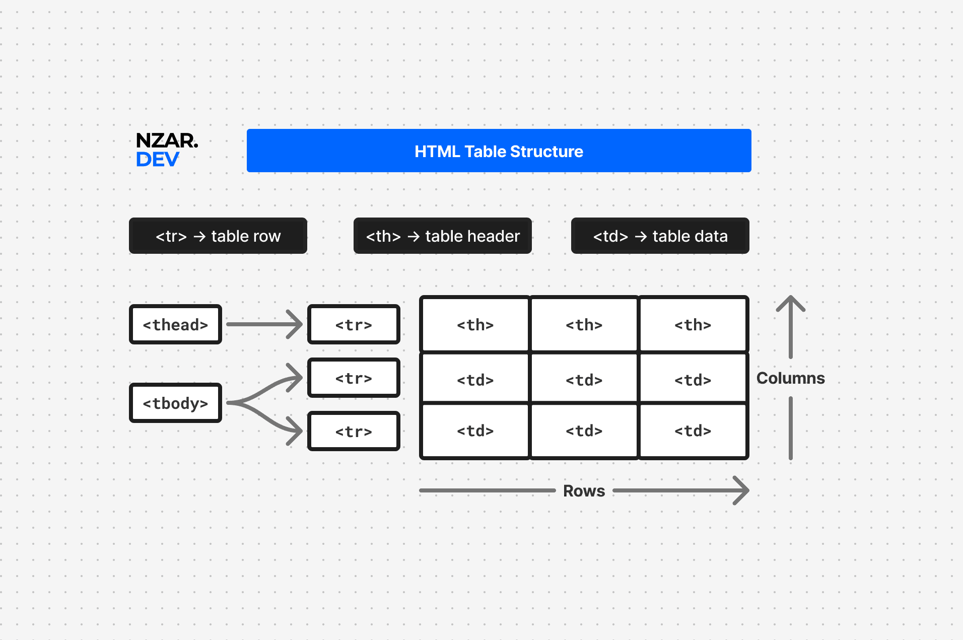
A properly built table uses a specific, meaningful set of tags, not just plain rows of generic cells.
<table>
  <thead>
    <tr>
      <th>Plan</th>
      <th>Price</th>
      <th>Storage</th>
    </tr>
  </thead>
  <tbody>
    <tr>
      <td>Basic</td>
      <td>$5/mo</td>
      <td>10GB</td>
    </tr>
    <tr>
      <td>Pro</td>
      <td>$15/mo</td>
      <td>100GB</td>
    </tr>
  </tbody>
</table>| Plan | Price | Storage |
|---|---|---|
| Basic | $5/mo | 10GB |
| Pro | $15/mo | 100GB |
<thead> groups the header row, <tbody> groups the actual data rows, and <tr> defines each individual row within either section. This split isn't just organizational, it gives assistive technology a clear signal about which row is a header and which rows are actual data, something a table built from nothing but generic rows can't communicate at all.
<th> vs <td>, and Why scope Matters
<th> marks a header cell, a label describing what the data in a row or column actually represents, while <td> marks a regular data cell. This distinction matters far more than it looks, especially for accessibility.
<th scope="col">Price</th>The scope attribute tells a screen reader whether a given header applies to the entire column below it (scope="col") or the entire row beside it (scope="row"). Without this, a screen reader user navigating cell by cell has no reliable way to know that a value like "$15/mo" belongs to the "Price" column and the "Pro" row, both at once. With it, every single cell can be announced together with its proper row and column context, exactly the way a sighted user sees it instantly just by glancing at the grid.
Giving Your Table a Title: <caption>
A table's own built-in title tag is easy to forget entirely.
<table>
  <caption>
    Monthly Subscription Plans
  </caption>
  ...
</table>
<caption> gives the table an accessible, announced title, read aloud before a screen reader even enters the table itself. It's a small tag, easy to skip, and immediately noticeable in its absence to anyone relying on assistive technology to understand what they're about to navigate through.
Merging Cells: colspan and rowspan
Sometimes a single cell needs to span multiple columns or rows, a section header spanning an entire table width, for instance.
<td colspan="3">All Plans Include 24/7 Support</td>colspan merges a cell across multiple columns, and rowspan does the same across multiple rows. Useful, but worth using sparingly, heavily merged tables can get genuinely confusing for both sighted users and screen readers to follow.
Tables on Small Screens
Tables don't naturally adapt well to narrow phone screens, a wide table with many columns simply doesn't fit. Common solutions include wrapping the table in a horizontally scrollable container, or restructuring the table into a stacked, card-like layout at smaller screen sizes using CSS. The actual techniques for building genuinely responsive layouts get their own full treatment in the responsive design article in the next part of this wiki, but it's worth knowing now that "just shrink it" is rarely the right answer for a table with more than a couple of columns.
A Complete Example
Bringing everything together, here's a properly structured, genuinely accessible pricing table:
<table>
  <caption>
    Monthly Subscription Plans
  </caption>
  <thead>
    <tr>
      <th scope="col">Plan</th>
      <th scope="col">Price</th>
      <th scope="col">Storage</th>
    </tr>
  </thead>
  <tbody>
    <tr>
      <th scope="row">Basic</th>
      <td>$5/mo</td>
      <td>10GB</td>
    </tr>
    <tr>
      <th scope="row">Pro</th>
      <td>$15/mo</td>
      <td>100GB</td>
    </tr>
  </tbody>
</table>
Notice the plan name itself is marked as <th scope="row"> here too, since "Basic" and "Pro" are genuinely headers for their own row, not just another piece of data sitting alongside the price and storage values.
Why This Matters
A table built from nothing but generic rows and cells might look identical to a properly structured one, right up until a screen reader user tries to navigate it, or you try to style it responsively and realize there's no real header row to target. The difference between a table that's genuinely usable and one that just looks like a grid usually comes down to exactly the small tags covered here, thead, th, scope, and caption.
And the bigger lesson underneath all of it: tables aren't inherently bad practice, they were just badly misused once, for a job CSS now handles properly. Used for what they were actually built for, real tabular data, they remain exactly the right tool, and one of the more accessible ones, when built correctly.
Accessible Forms
Why forms are one of the easiest things to get visually right and functionally wrong, and how to actually build one properly.
HTML Accessibility
What accessibility actually means beyond screen readers, how assistive technology reads your page, and when ARIA genuinely helps versus makes things worse.